
About Us

Singapore Carpentry group strives to provide superior carpentry, interior design and construction services at an affordable price.
This blog was created to showcase the challenges we faced in order to create the perfect home for you.


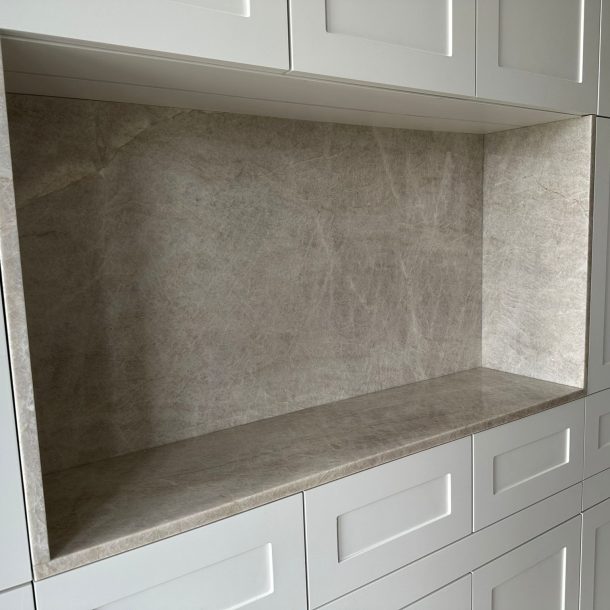
Sometimes a single element can throw an entire space off. In this project we received this heavily textured stone countertop with mismatched colors. The stone was a warm, dusty pink while the countertop top glass surface sat was in a much cooler white tone. The result felt visually split; the piece was interesting when it came to texture, but the colors looked ugly. Our design goal was simple: keep the tactile interest of the stone, but make the color language sit comfortably throughout the counter design.

This was not a spray-and-go fix. We treated the surface the way we would a piece of sculpture, respecting the texture while bringing tone into harmony. Rather than simply painting a single flat color, our team used successive thin layers by hand to build depth. This keeps the natural ridges and valleys of the stone lively and avoids a painted, plastic look.


All transitions were feathered by hand to respect the stone’s texture. Where needed, we lifted highlights and added gentle shadowing so the tactile quality reads beautifully under different lighting. Our team carefully layered the color on, until the counter surface’s color was unified with the stone base.

By shifting the stone’s tone rather than covering it outright, we preserved texture and made the piece feel intentional rather than remedied. A design rescue like this is as much about patience as it is about paint. Respect the original material, correct what’s throwing the space off, and then layer back the soul of the piece.
If you would like to find out more on elevating your interior design to the next level, feel free to click here for a free quotation and Singapore Carpentry’s team of talented interior designers will be on it!

Singapore Carpentry group strives to provide superior carpentry, interior design and construction services at an affordable price.
This blog was created to showcase the challenges we faced in order to create the perfect home for you.